Overview
This project consists of developing a website for a fitness company with provided content.
Starting off into groups to develop a brand for the fitness company and creating wireframes, we were then to branch off to give our own design to the website based on our developed wireframes.
Team: Rebecca Westcott & Aporva Bhardwaj
Launch site
Which content to prioritize?
Starting off this project, we were given content we could use for our fitness website. With our given information, as a team we had to figure out what is best to organize the content throughout each page. From there, we decided to rough sketches of wireframes for the pages.
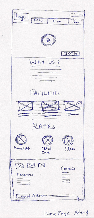
Figuring out the rough layouts for each page allowed us to see what content would users see first and what is most important to know about the fitness. Along with these rough sketches, we got a better understanding of how the layout for each page
would be.
Rough to Refinement
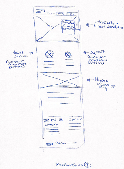
Upon doing the rough sketches, we started to do a more refined edition of the wireframes. Upon creating them, we also thought of the sitemap process.
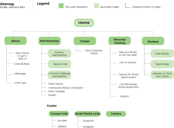
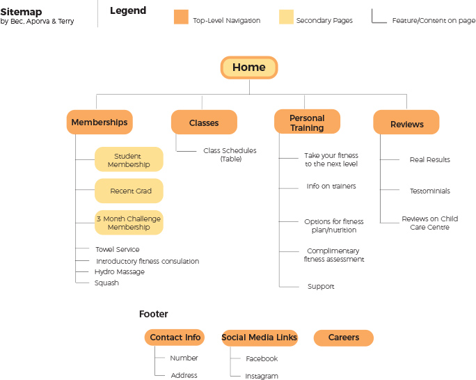
We wanted to have two approaches to these sitemaps to give us room to differientiate our projects when we diverge into creating our own designs of the website. With the sitemap finished, we got a better understanding of what each page would contain and figure out the flow of how each page would connect with each other.
With the sitemap finished, we started to create a more refined wireframes.
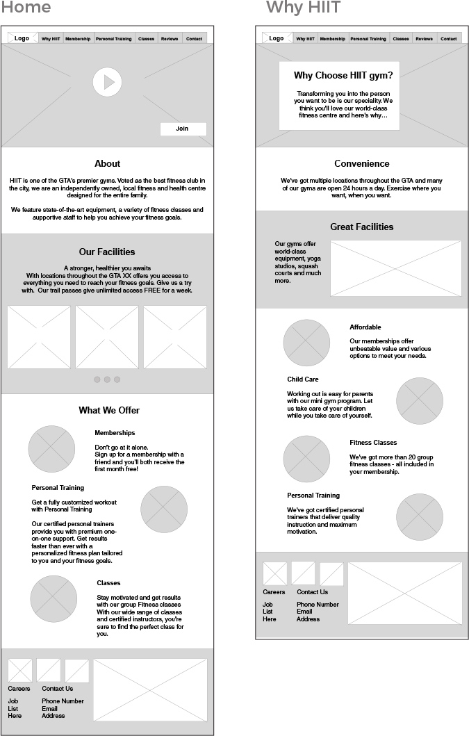
Our thought process for our layouts is to have the user’s eye move around the page, while also keeping each page consistent with each other.
See Wireframes
Figuring out the Mood
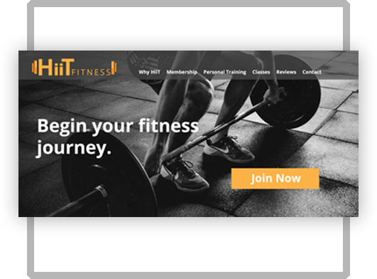
Starting to branch out from my group and start creating our own designs, I wanted to try exploring a more modern take on the layout. With ideas popping up in my mind, I decided to create style tiles!
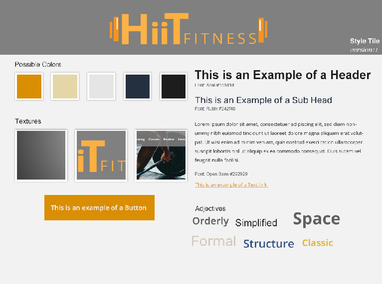
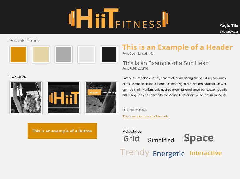
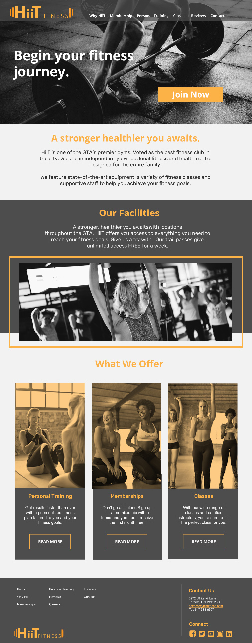
I wanted to explore having the color orange throughout the pages, as it symbolizes energy, enthusiasm and encouragement. Since this is a fitness website, I wanted to portray that throughout the pages.
Keeping the Consistency
When I seperated from my group and started my own designs, I started to realize how working in a team allows for different perspectives on a similar goal. Though we started in the same place, we branch off and created different styles of websites.
It is always nice to learn from others and see things from their perspective and learn about their own design choices.
Challenges and Goals
This project was quite the challenge as it was my very first website that I fully created and designed. I learned many things branching from keeping each page consistent with each other to learning how to prioritize certain content and not overwhelm the user with tons of information.
One of the challenges was figuring out how to layout the information that is not dependant on the wireframes. As sometimes, it tends to be blocky if the wireframes was used as an outline. It was quite the challenge to break out from that and find ways to expand from the wireframes.
Launch site
