Overview
For our final project leading into our grad show for the Web Design program at Sheridan, we were given the project to build a fake business and develop a marketing plan flushing out the idea and finally, developing a website to promote it.
Museum & Cafe for Gamers?
Starting out this project was quite difficult at first as we were given the choice of choosing our own topic to explore. Eventually, I choose one of my interests and narrowed down the possible topics. Thus, I decided to explore one of my favourite things to do when I’m not designing: gaming.
I wanted to create a business that both serves as a museum and cafe that welcomes all types of gamers: casual and competitive.
Also serving to be an explorative venue that captures the timeline of video games and allow visitors to appreciate the impact they left on
video game history.
Going forward with my topic, we were to start creating a marketing plan for our make believe business. Thinking about our targeted market and how to have our designs and the business itself capture our chosen audience.
Designing with the Audience in Mind
After finalizing the marketing summary of my business and finding different opportunities to cater towards my targeted audience, I started to have a better understanding of what design choices I would make to create the website.
Before starting any designs on the pages, I created wireframes to see how each page would be organized throughout the website.
Initial Homepage Wireframe
Initial Plan your Event Wireframe
Initial Plan your Event Wireframe
After creating wireframes for certain pages, I felt like I got a good grasp on how each page would be organized. Making the wireframes made me realize the type of information that would need to be favoured over other content. Originally, when making the wireframe for the homepage, I wanted to have some social media content highlighted. However, when I started to design the page, I felt like there was too many content on the homepage which made it quite overwhelming.
I decided to prioritize certain content to the homepage to avoid having too much information on the page itself.
Logo Designs
Beginning some logo designs, I thought of incorporating the fact that the venue is a cafe. Having the logo image depict a cafe mug, with gaming elements connecting the concept of the venue.
For font exploration, I wanted to choose rounded lettering to express a more welcoming feel.
Starting to develop more of the logo, I decided to bring in the gaming aspect of the venue. Along with each logo, I wanted to express having a retro feel adding 8-bit art to the logo image.
Further into the font exploration, I did some research into types of fonts in video games, especially in vintage games. Thus, I choose specific fonts that expresses more of a retro text-based gaming feel.
For the third development phase of the logo, I tried to tone down on the graphics and go for a more simplier tone, while also keeping the style of gaming. I decided to portray a controller, slowing dissolving into a 8-bit graphics.
Finally, after some much needed feedback, I ultimately decided to have fonts that represented gaming. I choose a font that has a retro feel and expresses the 8-bit stylized graphics. However, the image for the logo still felt very busy.
Final Logo

For my final iteration of my logo, I decided to tone down on the graphics of the image. Making it more simple and less busy for the viewers. I also focused on using one color than having a gradient to have it less busy. A nice touch added thanks to my professor, was to have the controller represent a mug, as to show to the viewers that it is also a cafe.
Finally, I made arrangements to the subtitle as to let the logo name be shorter and have the name roll off the tongue more easily.
Exhibition Page Layout Iterations
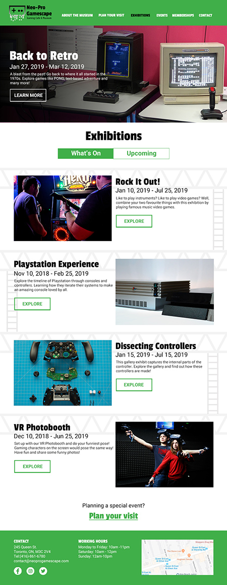
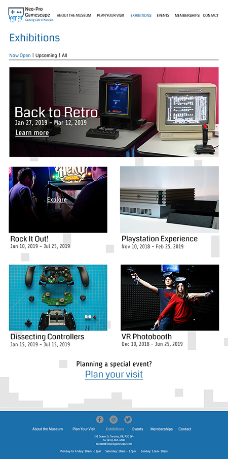
I began to start designing layouts for one page in two different styles. For the first layout, I decided to go for a more retro feel, choosing limited colors and paying homage to classic video games in the background. I also wanted to leave a bits of information about the exhibition in the first layout.
For the second layout, I decided to go for a more cleaner and simple design. Which the user can hover over the images, which leads them to another page about the exhibition. In this layout, the information is removed and looks more simple and less busy.
After some feedback, I went back to each layout and made specific changes.
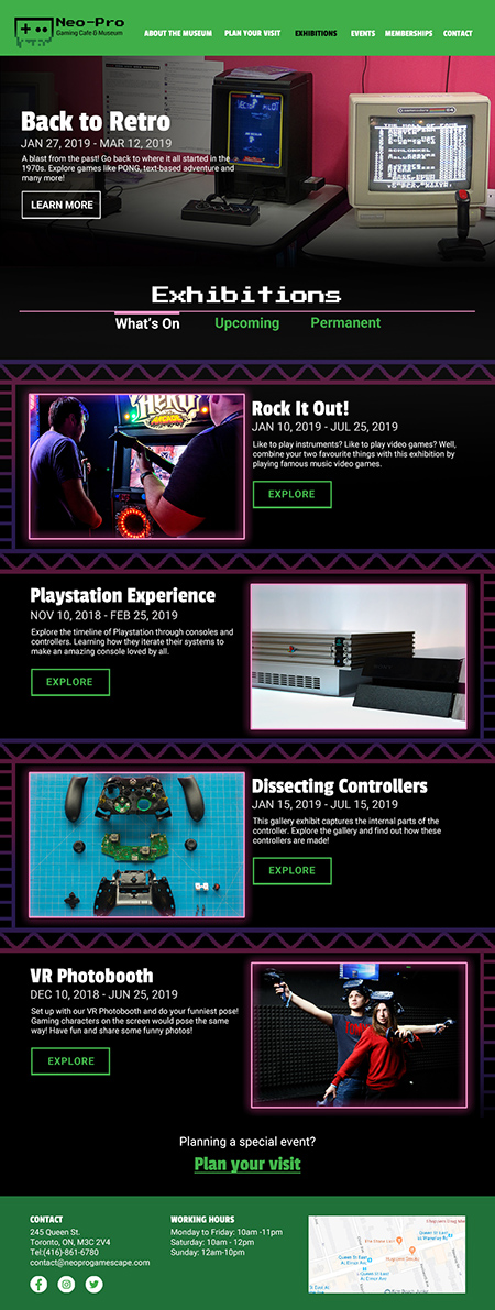
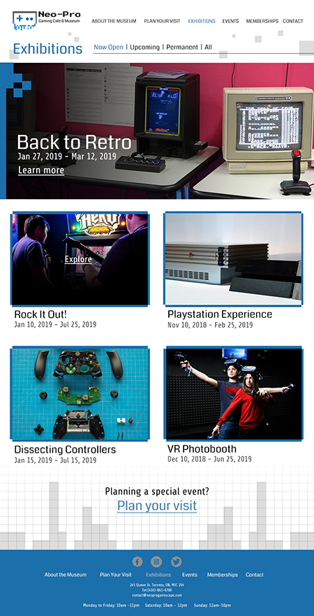
For the second round of layouts in two different styles, I decided to play more onto the gaming genre by having the gaming aspect speak more loudly in each layout, especially for the second layout.
Eventually, throughout these designs, I realized both flaws and how to combine these two designs together to create a more less busy page, while also keeping the aesthetic of video games.
In the end, I decided to go for the first layout because the page itself seems more fun to scroll through than just a page that has images without any information about the exhibition. Also, it moves the viewer’s eye along the page due to the background. Finally, it also expresses the mood of an arcade and it overall expresses fun
and gaming!
Back to Retro
Creating the designs for each page was quite the journey and one that I enjoy thoroughly. It was fun paying homage to favourite classic video games and creating a retro feel throughout each page.
I wanted the whole website to feel like one is entering an arcade and since I am catering towards millenials and also welcoming all types of gamers, including families. I wanted to have a sense of nostalgia with certain 8-bit characters seen in the pages.
Final Home Page Layout
Final Exhibitions Layout


